Monday, January 31, 2011

Techniques - C.W. Mundy, Part 2 of 2


Oil, 6 X 9 on Linen Panel

Demo: Flow Blue, Azaleas, and Copper
As we start, don’t assume that CW’s charismatic brushwork results from forgetting the fundamentals of drawing, value and color. His painting ability, knowledge, and mental effort are that much more in tune with the fundamentals of painting, which therefore allow him to work loose. A past reference to this would be the brushwork of Sargent, who could form an entire head with 20 brushstrokes, or even the modern day artists Carolyn Anderson, or Kevin Beilfuss who both use so little to show so much.

 
1. Composition, planning, & drawing

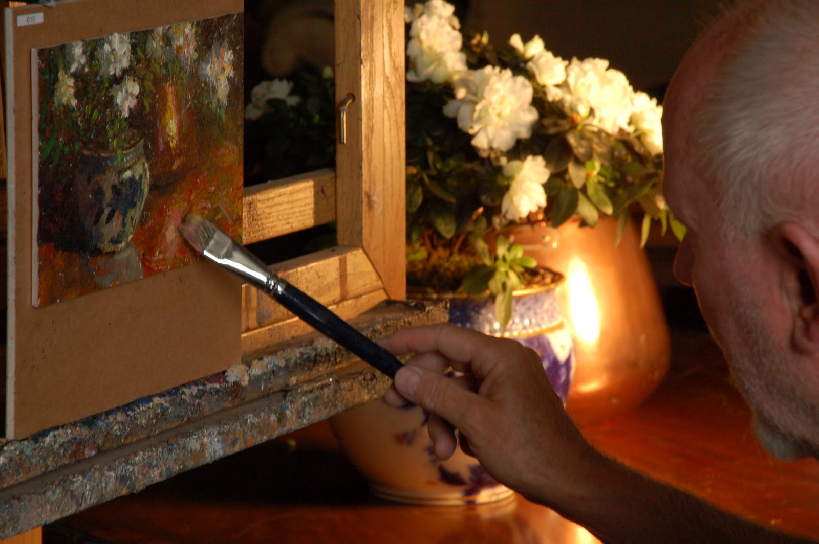
On a Claessens #13 portrait linen on Gatorboard (from Wind River Arts) CW marks out the frame reveal – which is necessary to keep in mind when painting small, making sure important information doesn’t get lost under the frame.

He draws with a small round brush and Yellow Ochre, paying most attention to his center of interest and marking other important landmarks. As in most paintings, this stage is critical for the success of the painting; a bad drawing means a bad painting.

 
2. Block-in

Working from dark to light, CW masses in the major shapes paying attention mostly to values and overall temperature; relying on his drawing for accurate placement.

3. Soften block-in

After the block-in, CW “neutralizes” some of the brushwork so that at the end of the painting, the final brushstrokes will have more importance. This softening technique also helps recede the tertiary areas, which is very important to achieving a life-like representation of what you actually are seeing, portraying how your eyes focus. To soften slightly in the primary or secondary areas, he wipes with one-ply Kleenex. To soften the tertiary areas, he uses two-ply.

4. Laying in foundations


After softening, CW moves into laying the foundation for the flowers. This involves laying in the overall value and shape, and refining the exterior edges.


5. Shadow side of flowers

With the same method as the block-in, CW lays in the darks/shadowed sides of the flowers first. He uses a technique called “Marbleized Paint” which was discussed in Part One.


6. Adding details and final strokes

Once CW has painted the major shapes, he begins adding more detail with final, thick brushstrokes. In the photo above, you can see that he has laid in many of the leaves, the thick reflection on the copper pot (Which as you will notice could have taken dominance in the painting, but he kept the brighter reflection, values, and details for the foreground object.), and the details of the Flow Blue vase, it’s shadows and reflections.

7. Laying in the reflection

CW continues with the details and adds the reflection to the table, which although simplified, adds depth to the background pot.

8. Correcting the darker value on the bottom of the brass pot

9. Correcting the edge of the flow blue Jardinière and making
sure the value is right for the painting.

10. Mirror check

Above is a picture of CW with a large mirror behind him. He always uses the mirror as a check and balance to his work. Because the execution of a painting goes so quickly, your objectivity is usually limited. But with the mirror, he is able to see it in reverse and this helps immensely in seeing the painting with a fresh eye.

If you haven’t already, check out part one of this post. It has some great content about CW’s specific mixing and painting methods. When tied with the above demo, I think you get a very thorough grasp of how CW creates his works.

To learn more about CW Mundy’s techniques, you can purchase his videos:
Mastering the Dramatic Still Life with C.W. Mundy
Painting the Figure
Painting the Still Life
En Plein Air Collection (Not a demonstration video, but an account of his painting trips)

To keep current with CW’s news and events, visit his blog

Friday, January 28, 2011

Techniques - C.W. Mundy, Part 1 of 2

I had the great opportunity this past fall to meet CW Mundy and to watch as he gave a still life demonstration. CW doesn’t fit the typical artist mold (you know . . . artsy long-haired Frenchmen with a goatee and cup of espresso), instead, he is a kind, beach clothes-wearing man with a booming voice and down-to-earth character. Matching this personality are his paintings, which follow no Salon or traditional style, but are loose, impressionistic, and filled with moving color.


I have wanted to focus more of my posts on the actual techniques of modern painters, and CW is a great place to start. Below is part one of a demo that he (and his wife Rebecca) so graciously sent over so that we can visually see the steps and techniques that he uses. Part two will walk us through one of his paintings step-by-step.

Materials and Methods

Color pots:
In the upcoming part two, as well as at the demo I attended in the fall, CW creates “pots” or piles of colors. The pot colors are color values in the main subject areas that he needs to paint, and they are mixed prior to painting.

Take for example a typical landscape, you have the sky value and color as a mass, a mountain range as a different value and color mass, then you have the foreground as a different value and color mass. The logical thing to do is to makes piles of those 3 values, so you can do your painting without having to continually mix paint as you go. That will take you out of your “zone” if you have to continually mix paint for the masses.

Bellagio, Lake Como 9 X 12

Also, there's a unifying factor that's crucial with color. Each pot color in this landscape is proportionally mixed with each mass color in the other two. In other words, the sky has some of the green from the foreground and some of the purple from the mountains. The green foreground will have some of the sky color and some of the mountain color in that pot. The mountain pot color will have the proportion of the foreground and the sky colors. This will unify the entire painting with color.

On location at Lake Como

Marbleized technique:
In addition to these loosely mixed pots of color, CW mixes paint in two main ways. The first is loosely mixing on the palette, either from modifying the pot colors, or creating a custom color. This mixing is done on the palette but as you can tell from his work, the colors are at most, folded color . . . never mixed together to form a flat color.


Now what is really exciting and important, besides just mixing paint on the palette, he will load up his brush with a pot color and then dip it into the pure chroma of the tube colors around the outer edge of the palette, stabbing various colors and picking up globs of paint that lay outside this main volume of pot color. Without mixing it, he will directly paint onto the canvas and thus "marbleize" the paint as he forms the stroke. He also finds that the effect is more easily accomplished using alkyds rather than straight oils, because alkyds have less pigment allowing them to marbleize better. Seeing this in person really blew my mind, I had never seen painting like this before and it seemed extremely exciting (and scary), but keep in mind that you need to know how and what color you are aiming for, if you get it wrong, you either have to scrap off the loads of paint, or add even more paint to edit your previous strokes.

Lighting:
When in the studio, CW generally lights his still lifes with warm light. As photographed in the post to come, he uses a high wattage tungsten floodlight. I’m not completely sure of the brand, but it looks like a 500-1000 watt unit that would probably cost a couple hundred bucks. He does not light his palette and canvas with the same light. He finds it is very important to have them always under natural light (in his studio, he has large windows behind him).

Palette:
CW paints with both standard oils and with Winsor & Newton Griffin Alkyds (Alkyds can be mixed with traditional oil colors, or can act as an underpainting, but should never be used above a layer of traditional oils. Alkyds dry with less elasticity and will cause cracking if above the more elastic, traditional oils.) In CW’s case, he either uses a full palette of one or the other.

Titanium White
Cadmium Yellow Light
Yellow Ochre (convenience color)
Cadmium Medium Red
Alizarin Crimson
Cerulean Blue
French Ultramarine Blue
Viridian
Terre Verte Green (convenience color)
VanDyke Brown
Dioxazine purple (convenience color)

(Notice the two pots of color here)

Tissues:
CW does not use paper towels to clean his brushes, instead he has a box of Kleenex tissues beside him for single use wipes. When he needs to wipe a brush, he grabs a tissue, wipes the brush, and then throws out the tissue. It’s fast, they are in a handy box, and are fairly cheap. Just don’t get the fluffy ones with all the lint and lotion.

Brushes:
Long-handled sable flat brushes: Rosemary 279 (but Langnickel 5590 will also work) – these are the brushes of choice for myself, and many of the “living masters.” The Rosemary’s are much more durable than the Langnickel, but both brushes create beautiful effects. They are fairly soft, and do take some getting used to compared to a hog bristle brush.

Various bristle flats and sable rounds

Go to Part Two of this post to read more

Wednesday, January 26, 2011

Painting Provincetown Video


Below is a video put together by Jon Goward and Paul Schulenburg. It is 35 minutes of interviews and conversations with the 12 artists that were a part of a group painting trip to the Cape this past Summer. Some of the artists include Jeremy Lipking, Ignat Ignatov, Stapelton Kearns, Michael Klein, Mark Hanson and many other well-known painters. This is the third year that this group (plus and minus a few) have gotten together, and the paintings have resulted in several shows and obvious friendships.

This video is a great way to learn more about some of these artists, and to get a glimpse of them working, I hope you enjoy it as much as I did.

The video can't be embedded here, so to view it, jump over to YouTube: Painting Provincetown

Wednesday, January 19, 2011

Painting Folder

I'm a bit of an art pack-rat, I have files, cd's, and shelves of art prints and books. If I'm not painting, I'm probably trying to get an art fix from looking through magazines and websites.

I love finding a new artist, or a painting that just blows my mind. Every artist is so unique and they take different approaches to their subject, their color choices, and even the way they mix and apply paint. That is why art is so great, each work is unique, there can never be another like it. The artists emotions, ideas, sensibilities and even brush hairs are in their paintings, and I find that so cool.

So, here a few recent additions to my art files:

Epiphany Portrait - Hal Yaskulka

Keira 16x12 - Hsin-Yao Tseng

Man in Blue 30x20 - Michael Carson


Pink Dress 16x12 - Hsin-Yao Tseng


The Cellist, 1908 - Joseph DeCamp

The Hug - Hal Yaskulka

Tuesday, January 11, 2011

Casey Baugh Updates


I was on Casey Baugh's site the other day and noticed a lot of updates that I thought I would make you aware of.


Casey just finished his first solo show with Wendt Gallery in NYC and his site has the 22 paintings from that show. I really loved Casey's previous paintings and some of these new ones aren't exactly my favorite, but there is no doubt that he is an amazing artist and perfect for the contemporary collector.


In addition to all the new works, he has added an archive section with a selection of his older paintings and drawings.


Casey has also started a new form of teaching through short videos. These videos walk you through one of his paintings and have in-process photos with voice-over. He is calling this "new" form of art demonstration Art Unlayered. I really like this concept and think that it could evolve into something great. For $15 each, these HD videos give you about 10 minutes of insight into his process. Below is a sample video from Casey (watch it on YouTube for the higher quality):

Monday, January 10, 2011

Not Far From Home - Daniel Gerhartz


This holiday season I received Daniel Gerhartz book, "Not Far from Home." It was self published and is offered through Liliedahl Video Productions (where his video demonstrations are also available). The book is 175 pages and co-written by Angela Sekerak, who studied a couple years behind me in art school and is equally a great artist and designer, helping Dan bring his work the presentation it deserves.


I used to work in both the publishing and printing industries, and I can say from experience that this book is one of the most beautiful and well-printed books that I have ever seen and definitely the finest in my library. It's cover is linen and gold-leaf and the interior printing has great color, a nice varnish on all the images, and the ink registration is spot on page after page. Kudos to The Fox Company, Lithographers, Inc. for a magnificent job on the production.


I have always enjoyed Daniel's paintings, but felt that sometimes they were to pastoral and maybe even cliche, but this book has changed my mind. Seeing them side by side and at a higher quality has put them in the category of timeless and masterful. He has accomplished a feeling of contemporary color and composition with century old brushwork and layering, and all this while working from life -- which he says is the one key to his success.


The book contains a forward by Richard Schmid, an intro by Dan, and a thorough biography by Angela. There are also 128 images, close-ups, studies, and one demonstration.


As a conclusion, this is one of the only art books that I feel is worth the cover price. I understand that because of shorter runs and self-publication that a lot of artists need to charge double or triple what you would expect from a large publishing house, but if Dan can create a book of this quality, everyone else should be able to as well. If your an artist or collector, you should have this book, and have it out so everyone can admire it.